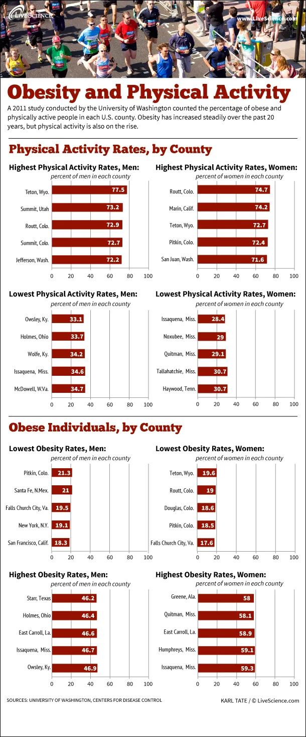
A 2011 study conducted by the University of Washington counted the percentage of obese and physically active people in each U.S. county. Obesity has increased steadily over the past 20 years, but physical activity is also on the rise.
Which counties were the most and least active for men in 2011?
Most active:
Latest Videos From
Teton, WY 77.5%
Summit, UT 73.2%
Routt, CO 72.9%
Summit, CO 72.7%
Jefferson, WA 72.2%
Least active:
Owsley, KY 33.1%
Holmes, OH 33.7%
Wolfe, KY 34.2%
Issaquena, MS 34.6%
McDowell, WV 34.7%
Which counties were the most active and least active for women in 2011?
Most active:
Routt, CO 74.7%
Marin, CA 74.2%
Teton, WY 72.7%
Pitkin, CO 72.4%
San Juan, WA 71.6%
Least active:
Issaquena, MS 28.4%
Noxubee, MS 29%
Quitman, MS 29.1%
Tallahatchie, MS 30.7%
Haywood, TN 30.7%
Which counties had the lowest and highest percentages of obesity in men in 2011?
Lowest:
San Francisco, CA 18.3%
New York, NY 19.1%
Falls Church City, VA 19.5%
Santa Fe, NM 21%
Pitkin, CO 21.3%
Highest:
Owsley, KY 46.9%
Issaquena, MS 46.7%
East Carroll, LA 46.6%
Holmes, OH 46.4%
Starr, TX 46.2%
Which counties had the lowest and highest percentages of obesity in women in 2011?
Lowest:
Falls Church City, VA 17.6%
Pitkin, CO 18.5%
Douglas, CO 18.6%
Routt, CO 19%
Teton, WY 19.6%
Highest:
Issaquena, MS 59.3%
Humphreys, MS 59.1%
East Carroll, LA 58.9%
Quitman, MS 58.1%
Greene, AL 58%


 Live Science Plus


