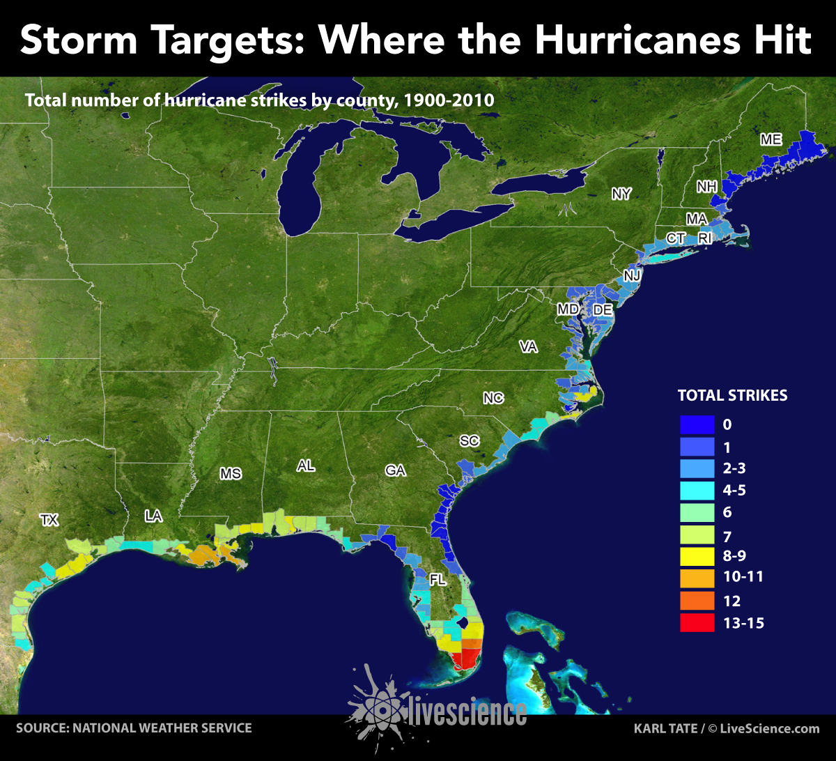
Storm Targets: Where the Hurricanes Hit (Infographic)
Infographics
By
Karl Tate
published
Add us as a preferred source on Google
Get the Live Science Newsletter
Get the world’s most fascinating discoveries delivered straight to your inbox.
By submitting your information you agree to the Terms & Conditions and Privacy Policy and are aged 16 or over.
You are now subscribed
Your newsletter sign-up was successful
Want to add more newsletters?
Join the club
Get full access to premium articles, exclusive features and a growing list of member rewards.
An account already exists for this email address, please log in.
Subscribe to our newsletter

Sign up for the Live Science daily newsletter now
Get the world’s most fascinating discoveries delivered straight to your inbox.
TOPICS

LiveScience Infographic Artist
Karl has been Purch's infographics specialist across all editorial properties since 2010. Before joining Purch, Karl spent 11 years at the New York headquarters of The Associated Press, creating news graphics for use around the world in newspapers and on the web. He has a degree in graphic design from Louisiana State University.
LATEST ARTICLES
 Live Science Plus


