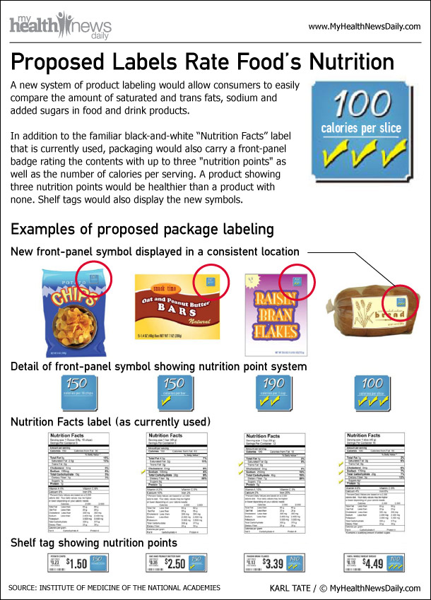
The barrage of symbols and health claims on food these days may leave consumers confused about which products are truly good for them. A new symbol would simplify things, the Institute of Medicine (IOM) says.
In a report today (Oct 20) the IOM recommended a single symbol, displayed on the front of packages , that would contain two pieces of information: the number of calories per serving, and a score that rates products based on their nutritional content.
Foods with high amounts of unhealthy nutrients, such as added sugar and sodium, would earn fewer points. The symbols should be found in the same location on all food products.
EMBED THIS GRAPHIC ON YOUR SITE
<a alt="<a href="http://www.livescience.com/35924-food-nutrition-front-package-label.html">((ImgTag</a> " href="http://www.livescience.com/35924-food-nutrition-front-package-label.html" _cke_saved_href="http://www.livescience.com/35924-food-nutrition-front-package-label.html">((ImgTag</a> ))<br> Source <a alt="<a href="http://www.livescience.com/35924-food-nutrition-front-package-label.html"> MyHealthNewsDaily.com: Your guide to wellness.</a> " href="http://www.livescience.com/35924-food-nutrition-front-package-label.html" _cke_saved_href="http://www.livescience.com/35924-food-nutrition-front-package-label.html"> MyHealthNewsDaily.com: Your guide to wellness.</a>
Sign up for the Live Science daily newsletter now
Get the world’s most fascinating discoveries delivered straight to your inbox.


