Winning Data Visualizations Reveal Information Is Beautiful

From a global temperature timeline dating back to the last ice age, to an evolutionary history of changing tastes in pop music, some of the past year's most outstanding data visualizations were recognized on Nov. 2, at the Kantar "Information Is Beautiful" awards.
The annual awards — launched in 2012 by brand-research company Kantar and data journalist David McCandless, author of "Information is Beautiful" (Collins, 2000) — highlight exceptional examples of data visualization. This transformation of data into images — abstract or representational — relays information visually, to communicate a story within the numbers.
Winners in 2016 included visualizations of the amount of dialogue spoken by men and women in nearly four decades of movies, global predictions for seasonal winds, and the deadliest mass shootings in the U.S. Some infographics were static, while others were interactive, and submissions represented professional designers and data visualizers as well as students. [In Images: Top Winners of 'Information Is Beautiful' Awards]
The top prize — the award for "Most Beautiful" data visualization of 2016 — was given to Peter Aldhous and Charles Seife for their entry "Spies in the Sky," a visualization of flight-tracking, revealing the hundreds of federal airplanes that observe America from above.
"Data visualization is a rising trend across every domain and discipline, from science and media to marketing and politics," McCandless said in a statement. "Done well, it's a very quick, powerful and memorable way to tell stories and engage audience with complex topics."
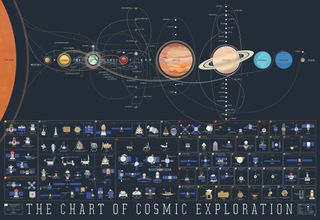
The winners of the 2016 awards, selected by a group of 30 data-visualization experts, exhibited an array of styles to address a range of topics — some somber and others whimsical.
Sometimes maps played a pivotal role in showcasing the data. For example, in Valerio Pellegrini and Michele Mauri's "The Missing Migrants Map," first-place winner in the "Infographic" category, colored shapes of varying sizes indicated where the greatest number of migrants disappeared or died while fleeing their homes for another country. The data for this project was compiled beginning in October 2013, after two shipwrecks near an Italian island claimed the lives of more than 368 people.
Sign up for the Live Science daily newsletter now
Get the world’s most fascinating discoveries delivered straight to your inbox.
And in one case, visuals no more complex than an array of 33,000 tiny squares assembled in a rectangular frame presented a sobering lesson about the deadly toll taken by guns in the U.S.
The interactive "Gun Deaths in America" by Ben Casselman, Matthew Conlen and Reuben Fischer-Baum was the third-place winner for "Data Visualization." It allowed viewers to click around inside the frame and see how many pixels appeared, with each one standing for a single gun death in one year. Each grouping represented different gun death statistics, such as the number of suicides, homicides or accidental deaths, and the demographics of the victims.
In a somewhat more lighthearted project, designer Martin Panchaud retold the story of the movie "Star Wars: A New Hope" in an infographic-inspired style, using diagram-like graphics and text to outline the film from start to finish in a file measuring 465,152 pixels in length. Panchaud explained in a statement that he was inspired by lengthy, ancient Chinese scrolls that needed to be unrolled from one end and then rolled up at the other as they were read. His entry won second place in the "Infographics" category.
You can see the full list of winners on the Kantor Information is Beautiful Awards website.
Original article on Live Science.

Mindy Weisberger is an editor at Scholastic and a former Live Science channel editor and senior writer. She has reported on general science, covering climate change, paleontology, biology and space. Mindy studied film at Columbia University; prior to Live Science she produced, wrote and directed media for the American Museum of Natural History in New York City. Her videos about dinosaurs, astrophysics, biodiversity and evolution appear in museums and science centers worldwide, earning awards such as the CINE Golden Eagle and the Communicator Award of Excellence. Her writing has also appeared in Scientific American, The Washington Post and How It Works Magazine. Her book "Rise of the Zombie Bugs: The Surprising Science of Parasitic Mind Control" will be published in spring 2025 by Johns Hopkins University Press.


