Rainbow-Colored, Animated Temperature Spiral Gets an Update

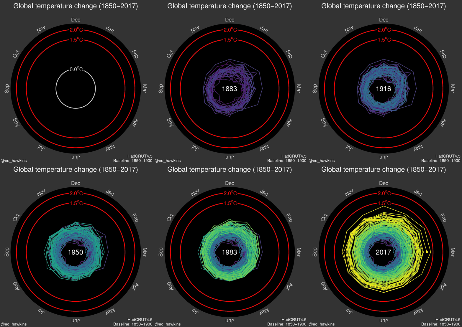
It was a year ago this week that climate scientist Ed Hawkins unveiled a climate visual that wowed the world: an animated spiral showing the inexorable rise of global temperatures thanks to humanity’s release of heat-trapping greenhouse gases.
The graphic featured, in eye-catching rainbow colors, the progression of temperatures from the late 19th century to today, as they begin to approach 2°C (3.6°F) of warming from that earlier, pre-industrial era.
In the landmark Paris climate agreement, countries agreed to keep warming below that level — and to try to aim for an even more ambitious 1.5°C (2.7°F) target. That agreement is now potentially threatened as the Trump administration mulls whether to pull out or weaken U.S. commitments to greenhouse gas reductions within it.
For its birthday, Hawkins has added the first few months of 2017 to the temperature spiral. Though 2017 is unlikely to best 2016 as the hottest year on record globally, so far each month of the year has ranked as second or third hottest, a clear sign of how much greenhouse gases have warmed the planet.
Hawkins, who works at the University of Reading in the U.K., made the spiral as part of an effort to find better ways to convey the stark warming of the planet to the public. The spiral treatment was suggested by a colleague, and, as Hawkins wrote in a blog post for the anniversary of the spiral, “it was a Friday afternoon – what else was I going to do?”
When he posted the graphic to Twitter, he thought it might generate some mild interest, but it quickly went viral: His original tweet has been retweeted more than 15,000 times. In the year since its inception, the graphic has been viewed 3.4 million times, he said.
“I was particularly pleased that the graphic engaged so many non-scientists and helped them to understand the reality of our warming planet,” he said in an email.
Sign up for the Live Science daily newsletter now
Get the world’s most fascinating discoveries delivered straight to your inbox.
Hawkins said one of the most exciting moments was when a version of it appeared during the opening ceremony of the Olympic Games in Rio.
The spiral plots monthly global temperature data from the U.K. Met Office and charts how each month compares to the average for the same period from 1850-1900, the same baseline used in the most recent report from the Intergovernmental Panel on Climate Change.
RELATED:
Swath of States Experiencing Hottest Year to Date We Just Breached the 410 Parts Per Million Threshold This Graphic Puts Global Warming in Full Perspective
The spiral shows how global temperatures fluctuate from year to year, but as the calendar dates progress, the overall warming trend becomes abundantly clear. By 2016, the hottest year on record, those monthly temperature anomalies edge close to the 1.5°C mark. While those exceptionally high temperatures received a boost from a strong El Niño, most of the warming is due to human-caused greenhouse gas emissions.
“We do not expect every year to set a new record and I think the spiral can help communicate these variations in global temperature,” Hawkins said. “For example, the large El Niño event in 1877-78 can be seen to warm the planet temporarily, but those temperatures have been long overtaken by the overall warming trend.”
The success of the temperature spiral led Hawkins and others to use the treatment for other climate indicators. One adds on to Hawkins’s graphic by plotting projections of warming to the end of the century assuming greenhouse gas emissions continue to rise at current rates.
Another shows how one of the worst greenhouse gases, carbon dioxide, has risen past a concentration of 400 parts per million, likely the first time that has happened in human history. This year, CO2 levels at the Mauna Loa observatory in Hawaii breached 410 ppm for the first time.
Hawkins thinks the temperature spiral is a tool that could help convince the public and governments that warming needs to be controlled.
“Many commentators used the graphic to suggest that global temperatures are ‘spiralling out of control.’ I would disagree,” he wrote. “The fact that humans are the dominant cause of the past changes means that we have control over what happens next. The positive message is that our choices now can dictate how the spiral evolves over the coming decades.”
You May Also Like: Interior Dept. Vows to Amend Methane Rule After Setback America’s Most Vulnerable to Rising Seas Glacier National Park Is Losing Its Glaciers U.S. Drought at Lowest Level in Nearly Two Decades
Original article on Climate Central.

Andrea Thompson is an associate editor at Scientific American, where she covers sustainability, energy and the environment. Prior to that, she was a senior writer covering climate science at Climate Central and a reporter and editor at Live Science, where she primarily covered Earth science and the environment. She holds a graduate degree in science health and environmental reporting from New York University, as well as a bachelor of science and and masters of science in atmospheric chemistry from the Georgia Institute of Technology.


