Why does the letter 'S' look like an 'F' in old manuscripts?

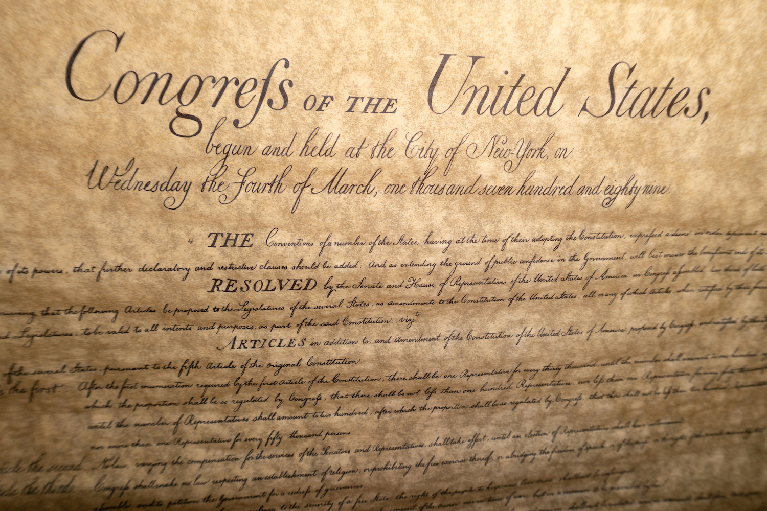
If you've ever had the pleasure of looking at a centuries-old manuscript, like an original handwritten copy of the U.S. Bill of Rights or a first-edition printing of John Milton's epic poem "Paradise Lost," you may have stumbled over an unfamiliar letter: the long s.
To modern readers, the long s (written as 'ſ') might make you think you're catching misspellings or typos like "Congrefs" instead of "Congress" or "Loft" instead of "Lost." Look closer though and you'll notice that, unlike an f, the character either has no crossbar or only a nub on the left side of the staff. Though it may seem more like an f, the letter is just another variation of the lowercase s.
Where did the long s come from and why has this character largely disappeared? John Overholt, a curator at Harvard University's Houghton Library, told Live Science that the long s originated in handwriting and was later adopted in typography when printing became widespread in Europe during the Renaissance.
Related: Why do people hate Comic Sans so much?
The long s can be traced back to Roman times, when the lowercase s typical took an elongated form in cursive writing in Latin. According to librarians at the New York Academy of Medicine, people were using the long s at the beginning and middle of words by the 12th century.
The long s and the more familiar short s represent the same sound, and the rules for using long s versus short s varied over time and place, Overholt said.
Some of the rules written in English included not using the long s at the end of a word ("success" becomes "ſucceſs") and not using the long s before an f ("transfuse" becomes "transfuſe") and always using the short s before an apostrophe.
Sign up for the Live Science daily newsletter now
Get the world’s most fascinating discoveries delivered straight to your inbox.
Overholt said that while there may have been consistent standards for using the long s, these rules were also a little arbitrary, like the rules that govern capitalization.
"There's a generally agreed upon practice in a given time and place for what constitutes standard capitalization, but it's changed significantly over time within the English language, and today, for example, the rules in English and German are distinctly different," Overholt said. (In German all nouns, not just proper ones, are capitalized, so that "nature" becomes "Natur," for example.)
The long s started to be seen as antiquated in the late 18th century, Overholt said, and it began disappearing. Different sources blame different people for the death of the long s.
In France, publisher and printer François-Ambroise Didot abandoned the long s in his new more modern typeface around 1782. Soon after, the English bookseller and publisher John Bell omitted the long s in his editions of Shakespeare's texts, reasoning that it would prevent confusion with the letter f and keep the lines of the text more open visually.
The end of the long s was quite abrupt in English printing, occurring around 1800, but the character lingered a little longer in the U.S. Outside of manuscripts and antique books, you might only encounter the long s in German, where it lives as one half of the "Eſzett," or double s character (written as 'ß').
- Breaking the code: Why yuor barin can raed tihs
- Why can't Germans say 'squirrel'?
- Why you say 'um' before certain words
Originally published in Live Science.


